


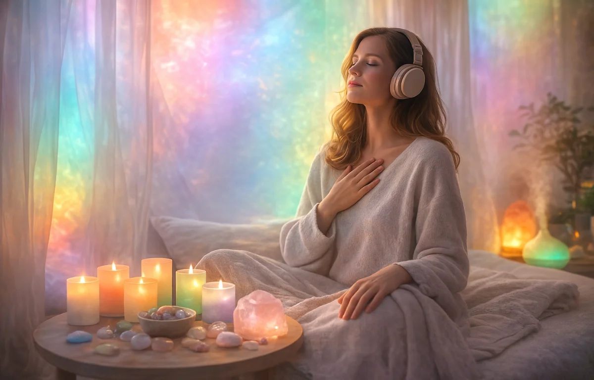
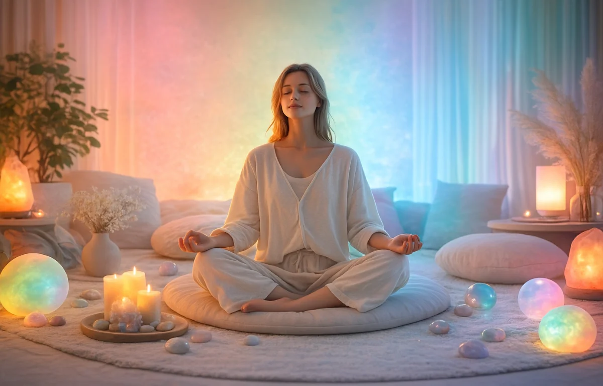
Kolor jako sygnał sensoryczny, a nie symbol
Przyzwyczailiśmy się mówić o kolorze językiem znaczeń: uspokajający, energetyzujący, ciepły, chłodny. Jednak dla ciała kolor nie jest interpretacją. Jest bodźcem — falą świetlną o określonej długości, którą układ nerwowy rejestruje jeszcze zanim pojawi się myśl lub ocena emocjonalna.
Informacje wzrokowe z siatkówki trafiają nie tylko do kory wzrokowej, lecz także do struktur podkorowych — w szczególności do podwzgórza, które koordynuje rytmy hormonalne, cykle okołodobowe oraz reakcje napięcia i regeneracji. Dlatego kolor wpływa nie tyle na „nastrój”, ile na tryb funkcjonowania ciała: może zbierać lub rozluźniać, przyspieszać albo pozwalać na spowolnienie — bez świadnego wysiłku.
Ludzie czasem mówią, że w pewnych okresach „nie mogą patrzeć” na intensywne kolory. Nie jest to metafora ani kwestia gustu. To cielesna reakcja przeciążonego układu nerwowego, który nie jest już w stanie tolerować nadmiaru stymulacji.
Kolor a autonomiczny układ nerwowy
Z perspektywy neurofizjologicznej kolor jest częścią obciążenia sensorycznego — obok dźwięku, dotyku i ruchu. Jaskrawe, wysokokontrastowe barwy zwiększają liczbę sygnałów, które mózg musi przetworzyć, podtrzymując aktywację współczulnego układu nerwowego — stan mobilizacji i gotowości.
Przeciwnie, złożone, stonowane, nieagresywne kolory redukują szum sensoryczny. Nie „przytrzymują” uwagi siłą i ułatwiają ciału przejście w tryb przywspółczulny — stan, w którym możliwe stają się głębszy oddech, poczucie oparcia i regeneracja.
Warto zaznaczyć, że nauka nie potrafi jeszcze precyzyjnie określić, który konkretny odcień wywołuje określoną reakcję u każdej osoby. Badania nad regulacją sensoryczną oraz obserwacje kliniczne pokazują jednak, że układ nerwowy reaguje przede wszystkim na intensywność, kontrast i czas ekspozycji bodźca wzrokowego — szybciej niż na symboliczne znaczenia kolorów.
Kolor, hormony i stan bazowy
Kolor nie steruje hormonami bezpośrednio. Kształtuje jednak środowisko, w którym ciało wybiera określony scenariusz hormonalny. Stałe wizualne nasycenie sprzyja stanowi mobilizacji i podwyższonemu tłu kortyzolowemu. Miękkie, stabilne środowisko kolorystyczne przeciwnie — ułatwia przejście w tryby regeneracji.
Dlatego kolor naturalnie wpisuje się w szerszy kontekst relacji między stylem a układem hormonalnym, omówiony w głównym artykule klastrowym Moda i hormony: jak styl reguluje kortyzol i dopaminę. Kolor pojawia się tu nie jako element dekoracyjny, lecz jako część hormonalnej ekologii codzienności.
Kiedy kolor przestaje wspierać
Kolor ma również drugą stronę. Może nie tylko uspokajać lub stymulować — może także wyczerpywać. Nawet wtedy, gdy wygląda „ładnie” lub „modnie”.
Stała ekspozycja na intensywne palety, czyste barwy i ostre zestawienia tworzy tło przeciążenia. Ciało nie ma możliwości „odpocząć wzrokiem”. Dla osób wysoko wrażliwych oraz w okresach wypalenia czy zmian hormonalnych rezygnacja z aktywnych kolorów bywa nie wyborem estetycznym, lecz formą samozachowania.
Kolor jako łagodna forma samowsparcia
W przeciwieństwie do większości narzędzi samopomocy, kolor nie wymaga aktywnego zaangażowania. Nie domaga się decyzji, dyscypliny ani pracy nad sobą. Po prostu jest — w przestrzeni, w ubraniach, w przedmiotach, które nas otaczają.
Dlatego kolor można uznać za jedną z najłagodniejszych form samowsparcia. Nawet gdy brakuje zasobów, by „pracować nad sobą”, nadal działa — stabilizując tło i pomagając ciału wrócić do własnego rytmu.
Mikropraktyka 1: obserwacja reakcji ciała na kolor
Przez jeden dzień spróbuj zwracać uwagę nie na to, które kolory lubisz, lecz na to, jak reaguje twoje ciało.
- Gdy wzrok zatrzymuje się na danym kolorze — czy zmienia się oddech?
- Gdy wchodzisz do przestrzeni lub zakładasz ubranie — pojawia się napięcie czy poczucie oparcia?
- Wieczorem — które kolory łatwo przywołać w pamięci, a które nie?
To, co ciało „pamięta”, zazwyczaj działa wspierająco. To, co szybko wyczerpuje uwagę, ma tendencję do nadmiernej stymulacji — nawet jeśli wygląda estetycznie.
Kolor, faktura i doznania cielesne
Kolor nigdy nie istnieje w oderwaniu od materialności. Ten sam odcień na sztywnej, błyszczącej powierzchni i na miękkiej, matowej tkaninie jest przez ciało odbierany inaczej.
To powiązanie koloru, faktury i gęstości materiału zostało omówione w artykule Miękkie i strukturalne faktury: jak tkanina wpływa na stan ciała, a także w jego wymiarze sezonowym — w tekście Jesienne faktury i spowolnienie. Kolor w połączeniu z fakturą tworzy nie obraz, lecz stan.
Mikropraktyka 2: sensoryczne minimum
Jeśli czujesz zmęczenie bez wyraźnego powodu, spróbuj przez kilka dni ograniczyć obciążenie sensoryczne:
- pozostaw 1–2 kolory jako tło;
- unikaj ostrych kontrastów;
- pozwól, by kolor pozostał nienarzucający się.
Nie jest to rezygnacja ze stylu, lecz tymczasowe stworzenie wizualnej ciszy — tak potrzebnej układowi nerwowemu, jak cisza po głośnym dźwięku.
Kolor a wewnętrzna obecność
Dla wielu osób kolor staje się sposobem podtrzymywania kontaktu z samym sobą — bez analizy i wyjaśnień. Pomaga skierować uwagę do wewnątrz, nie przeciążając psychiki.
Ten wymiar znajduje logiczne rozwinięcie w artykule Wewnętrzna obecność i styl: jak ubrania wpływają na psychikę i odczuwanie siebie.
Kolor jako łagodna terapia nie dotyczy „właściwych” palet ani uniwersalnych recept. Chodzi o uważność na reakcje ciała: gdzie pojawia się napięcie, a gdzie otwiera się przestrzeń na oddech. Często ciało wie wcześniej, niż jesteśmy w stanie to wyjaśnić.
Być może dlatego tak wyraźnie odczuwamy „nie-nasz” kolor — nie jako błąd stylistyczny, lecz jako zakłócenie wewnętrznego rytmu.
Źródła
- Elliot A.J., Maier M.A. Color psychology: Effects of perceiving color on psychological functioning in humans. Annual Review of Psychology.
- Kandel E.R. et al. Principles of Neural Science. McGraw-Hill.
- Goldstein E.B. Sensation and Perception. Cengage Learning.
- Ulrich R.S. et al. Stress recovery during exposure to natural and urban environments. Journal of Environmental Psychology.